© 2026 ALLCITY Network Inc.
All rights reserved.


The 2022-23 editions of Adidas’ Reverse Retro jerseys have been released! Like everyone else, the CHGO Blackhawks crew had their thoughts on the designs. Some were good. Some were the Blackhawks. Let’s get to it.
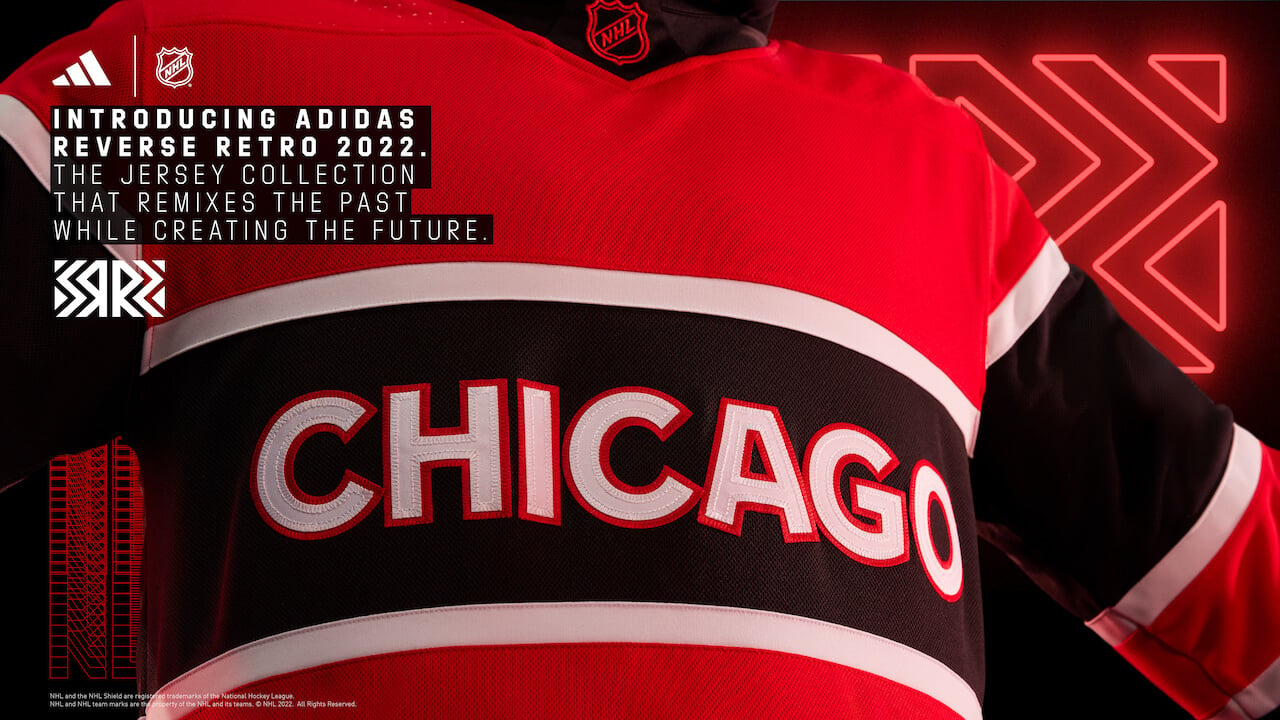
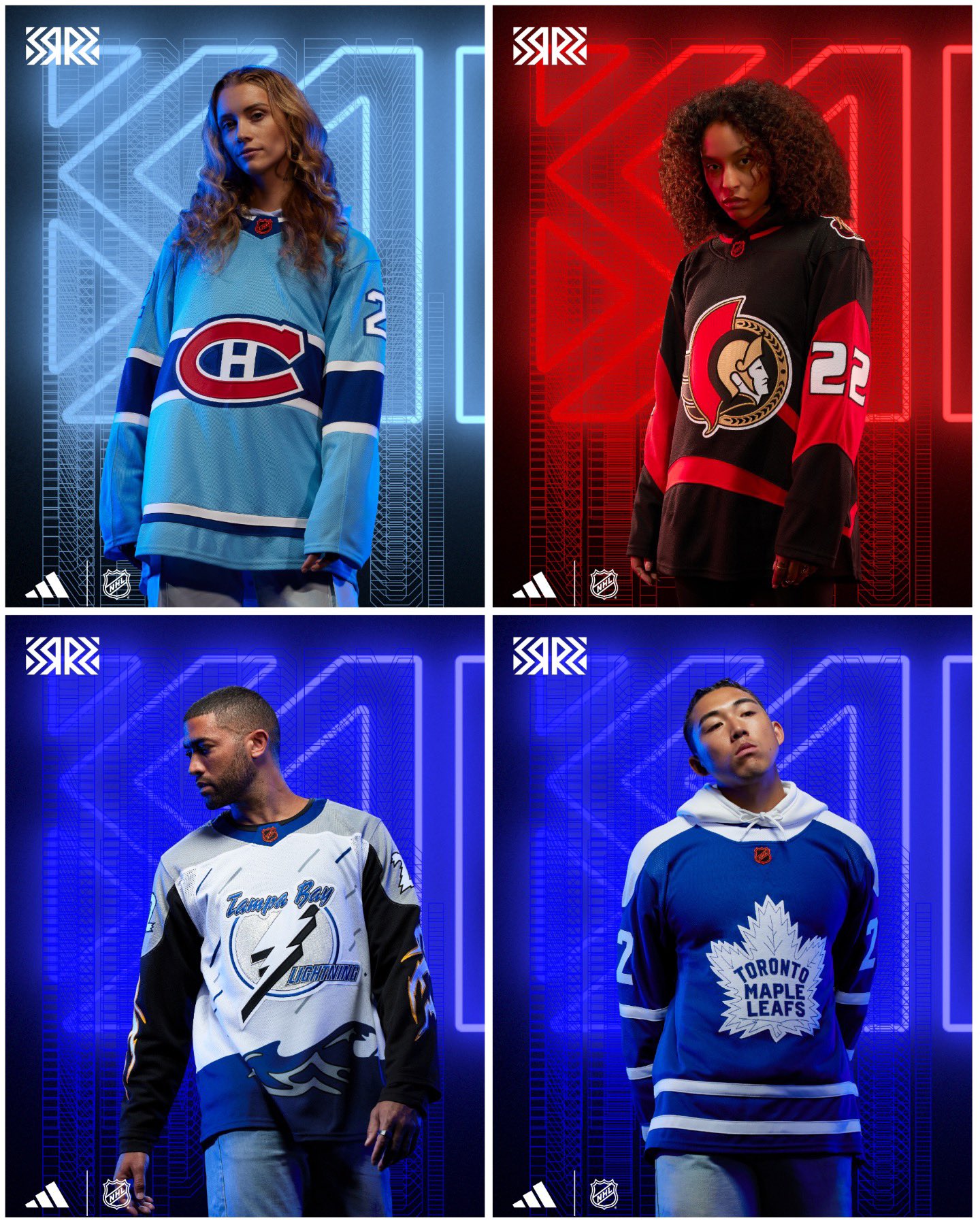
Chicago Blackhawks
Mario Tirabassi: “It just completely misses the mark for me. Why couldn’t the Blackhawks have just done the barber pole?” D+
Jay Zawaski: “I bet it looks better in person. From the 300 level. From the last row. Wearing sunglasses.” D

Greg Boysen: “The Red Wings have the same freakin’ jersey!” D
Boston Bruins
GB: “When you zoom in on the bear, he’s kind of giving you a sideways look. I like the bear. It’s cool.” B-
JZ: “I didn’t like this when it came out, and I don’t like it now.” D
Don't like ads?
MT: “I really like this look. Changing it from the yellow primary to the white makes a big difference.” A-
Buffalo Sabres
JZ: “I really like this one. This is the idea of the Reverse Retro. I think it’s perfectly executed.” A
GB: “I wish there was a little more blue. I dig it. Good job.” B
MT: “I give it 2.5 out of 5 sabres.” C+
Detroit Red Wings
MT: “It sucks!” F
JZ: “The basically copy and pasted the Blackhawks one. It’s slightly worse than the Hawks.” D-
Don't like ads?
GB: “It’s lame. It has no creativity.” F
Florida Panthers
JZ: “I think they’re kinda cool. They look like they should be on a bathing suit or bikini.” B+
GB: “I absolutely love this jersey. I love the powder blue.” A+
MT: “Four out of five stars.”
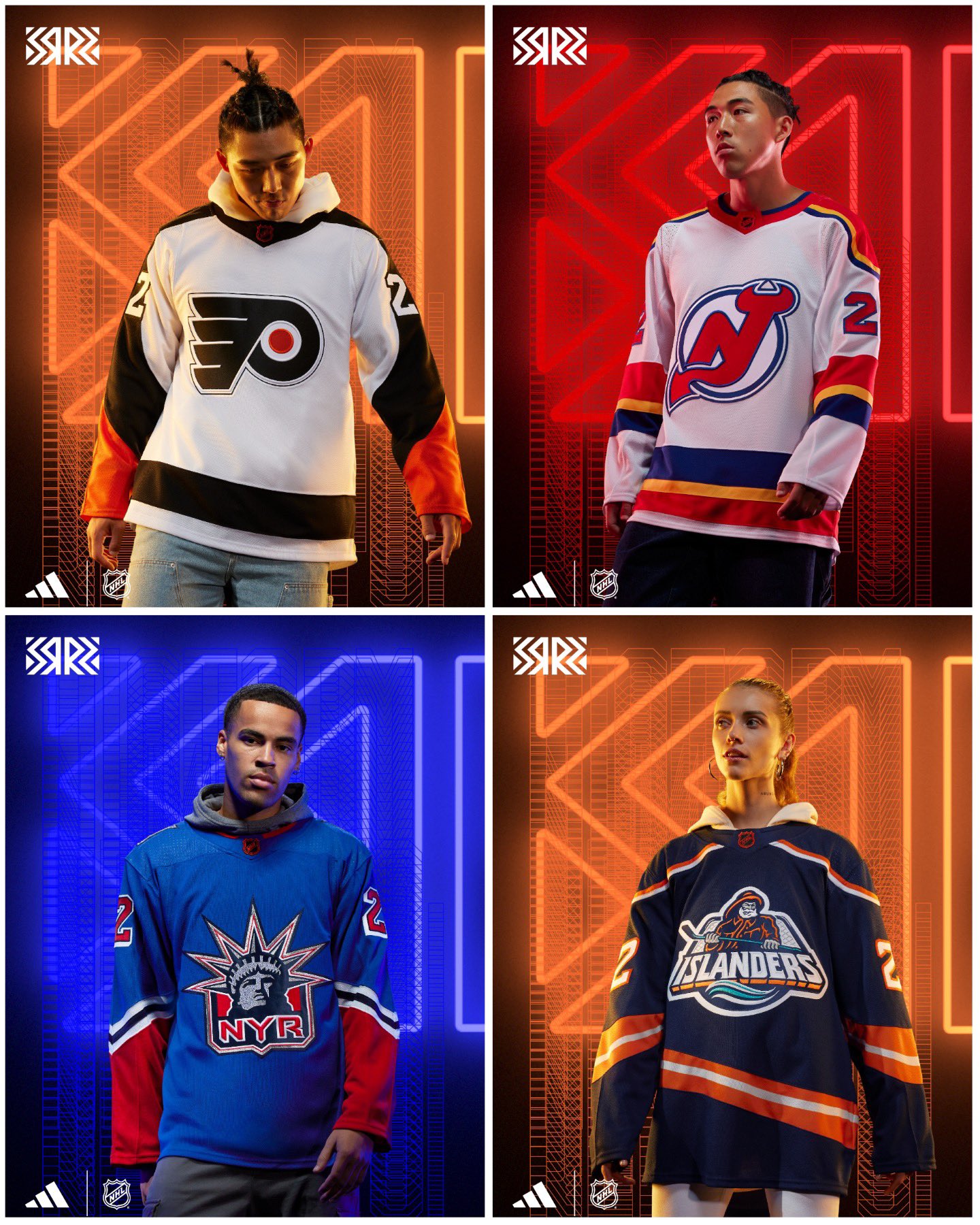
Philadelphia Flyers
JZ: “They’re fine. I’d rather see the Hawks do something like this, rather than what they did. I don’t mind it.” B
GB: “It’s not creative. It’s their regular jersey with different arms…big effin’ deal.” D
Don't like ads?
MT: “It does nothing for me.” C+
New Jersey Devils
JZ: “Solid. It’s keeping the classic look throwing back to the KC Scouts.” B
GB: “I like the color scheme.” C+
MT: “It’s okay. I gave it a thumbs up.”
New York Islanders
JZ: “It’s a throwback…to a jersey that sucked.” D
GB: “It’s good. Not great.” C+
Don't like ads?
MT: “If they had kept the wave pattern, I think I could have liked it more.” C+
New York Rangers
JZ: “The Rangers blue is the best blue in sports.” B-
GB: “I never really cared for that logo, but the original blue and red make it better.” C
MT: “I have it 3 ‘I Heart NYs” out of five.”
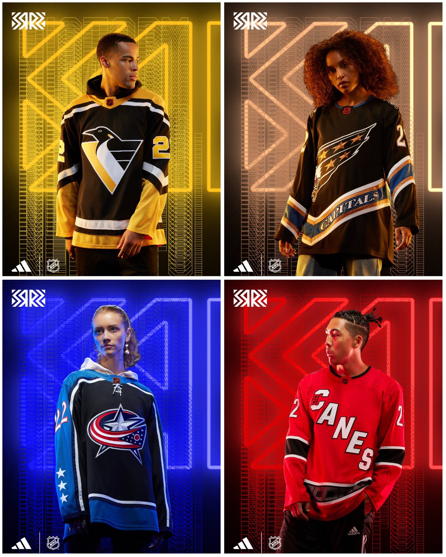
JZ: “I call this the Fascist Penguin.” D
GB: “Been there. Done that.” C-
Don't like ads?
MT: “I really like it. Getting rid of the grey is a big upgrade.” A
Washington Capitals
JZ: “It does look very 90s, but that’s kind of the idea here.” B
GB: “I wish they’d done this in the current colors.” B-
MT: “One of my favorite designs.” A
Carolina Hurricanes
JZ: “Been there. Done that. Seen it.” C
GB: “Lame. Boring. No creativity.” F
Don't like ads?
MT: “They are in my bottom five.” F
Columbus Blue Jackets
JZ: “This is basically what they already wear. Meh. It is the Columbus Blue Jackets of hockey jerseys.” C
MT: “I gave it a limp cannon.”
GB: “I like the light blue.” C-
Montreal Canadiens
JZ: “This one I really like.” A
GB: “An ode to the Montreal Expos, which I love. I own two Montreal Expos hats.” A+++++
Don't like ads?
MT: “I gave it an ‘eh’. The dark blue on the back looks really nice.” A
Ottawa Senators
JZ: “Old jersey, current logo, smashed together.” C
GB: “I like the fonts of the numbers.” C+
MT: “I gave it a de-B-rincat.” B
Toronto Maple Leafs
JZ: “This has the look of an NHL 94 jersey. One color on the shoulders, another on the bottom.” B
GB: “We’ve seen it before. There’s no creativity.” F
Don't like ads?
MT: “I gave it an A.” A
Tampa Bay Lightning
JZ: “I can almost see Chris Gratton skating around the ice.” C
GB: “I like it. It’s tacky.” B
MT: “There’s a lot going on on this jersey. I hate these. These look awful.” F
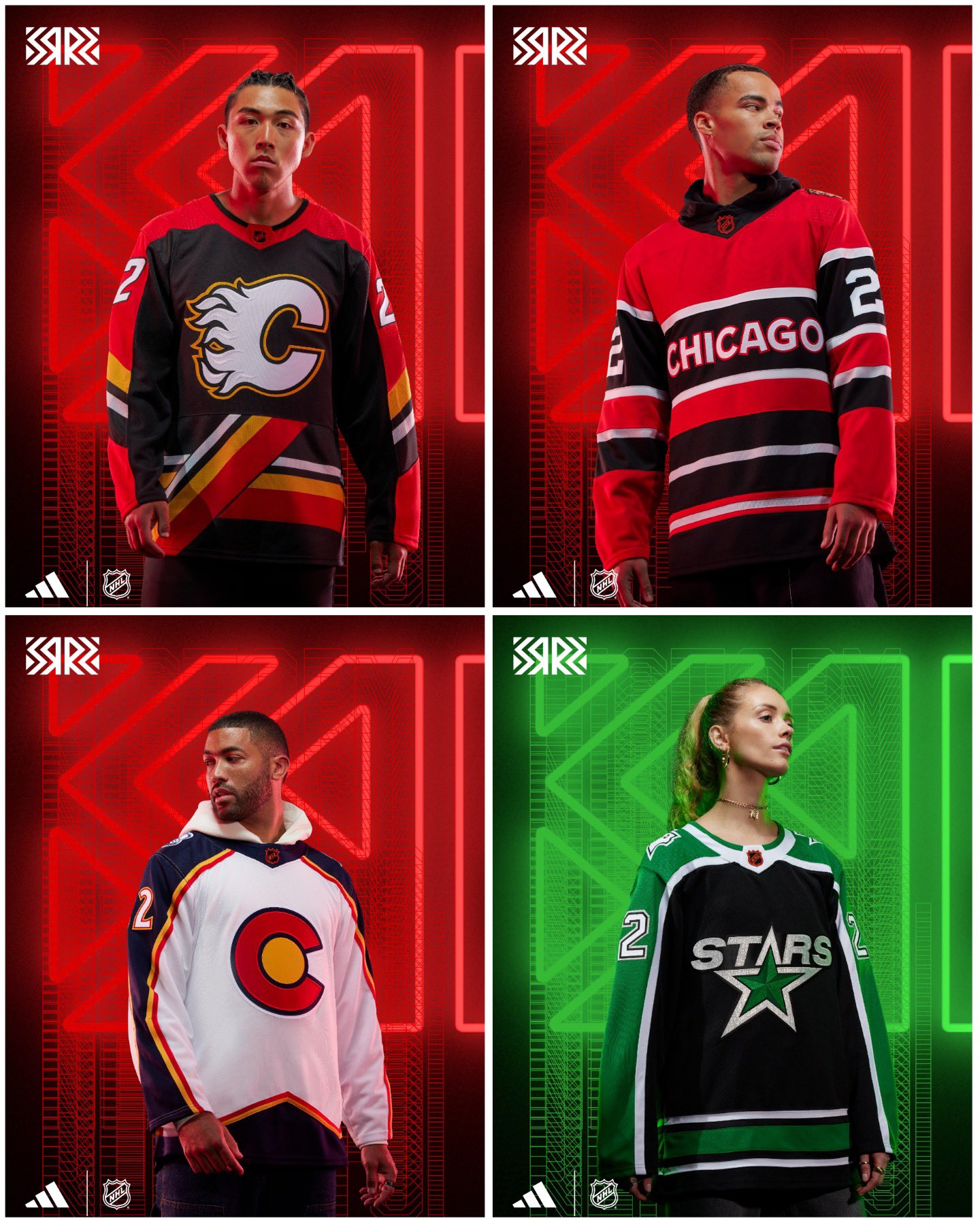
Calgary Flames
JZ: “They had these for way too long. They finally went back to the best uniforms in hockey. To go back to these? No. This ain’t it, as the kids day.” D
GB: “It does nothing for me. It sucks.” F
Don't like ads?
MT: “It reminds me of my grade school math book.” C-
Dallas Stars
JZ: “This is another in the NHL 94 design, for me.” B-
GB: “It’s better than the ones they had last year where it looks like they washed them with a green highlighter.” C
MT: “Three out of five stars. At least it doesn’t look like the Blackhawks’ jersey.”
Colorado Avalanche
JZ: “The C with the sun in the middle is not working for me with the Avs. I don’t hate it. I don’t love it.” B-
GB: “They’ve done that before. They’ve incorporated the flag.” C
Don't like ads?
MT: “They reminded me of Pac-Man.” C-
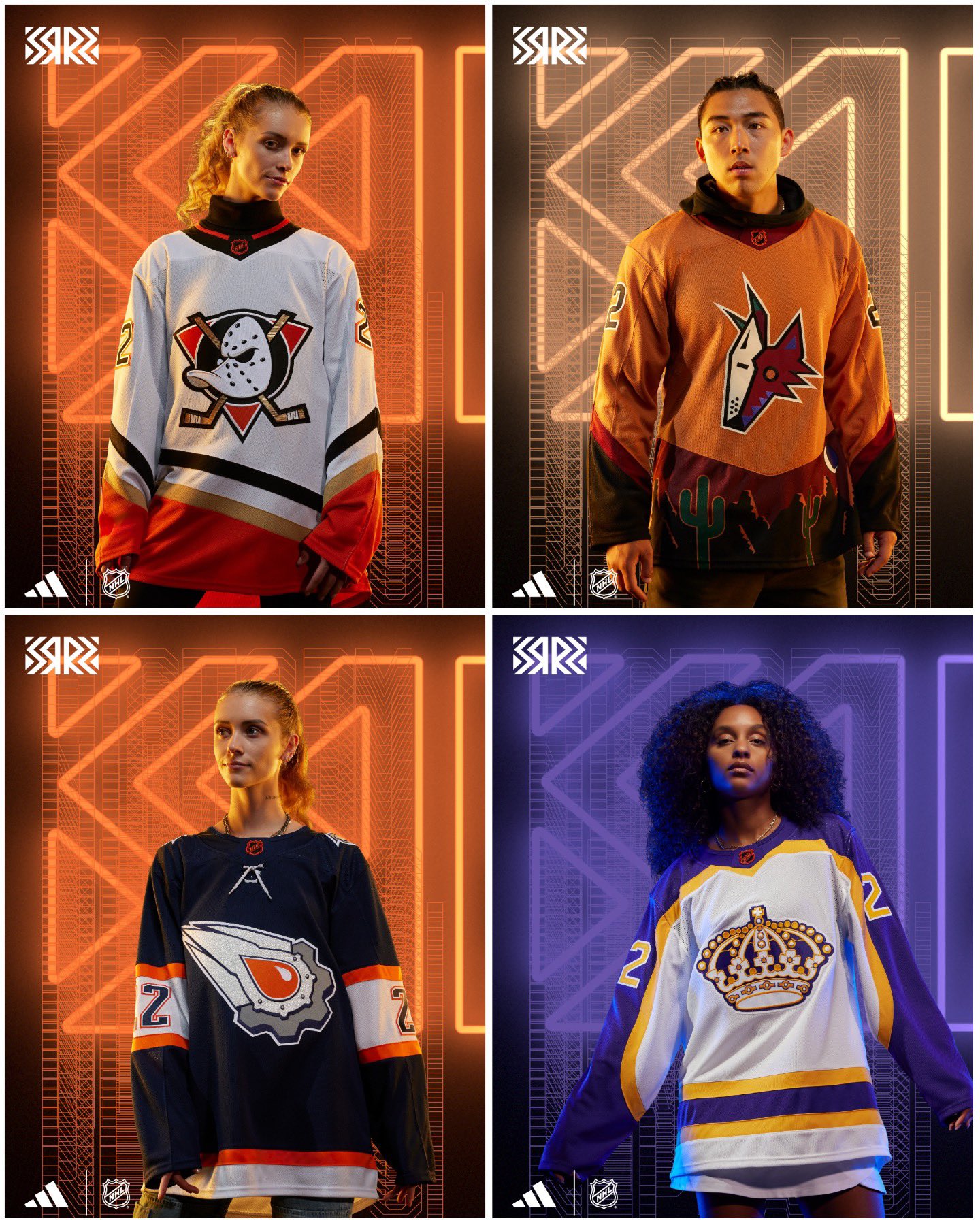
Anaheim Ducks
MT: “I have a feeling this logo will become their primary logo with their current color scheme.” A
GB: “Big fan.” A
JZ: “The colors suck. It looks like my aunt’s couch from 1979. Stop it. Give people what they want. They want the classic Ducks jersey. Stop forcing orange, gold and black on everybody.” Big Steaming Turd (F)
Arizona Coyotes
JZ: “These are the worst jerseys I’ve ever seen. The model looks upset.” F–
GB: “If you want to encapsulate what it’s like to be a Coyotes fan, it would be these uniforms.”D-
Don't like ads?
MT: “I gave it a Mullet Arena capacity of Fs.” F x5000
Los Angeles Kings
JZ: “These are sweet.” A
GB: “Blades of Steel, baby. I wish they were the full gold, but I like the white.” A
MT: “They’re going to sell a lot of these.” B+
Edmonton Oilers
JZ: “It’s fine if you liked this. This, to me, is a very 90s look.” C
GB: “I’m glad they went back to the orange and blue.” C+
Don't like ads?
MT: “I don’t think it looks good. It makes me sad.” Sad Face Emoji
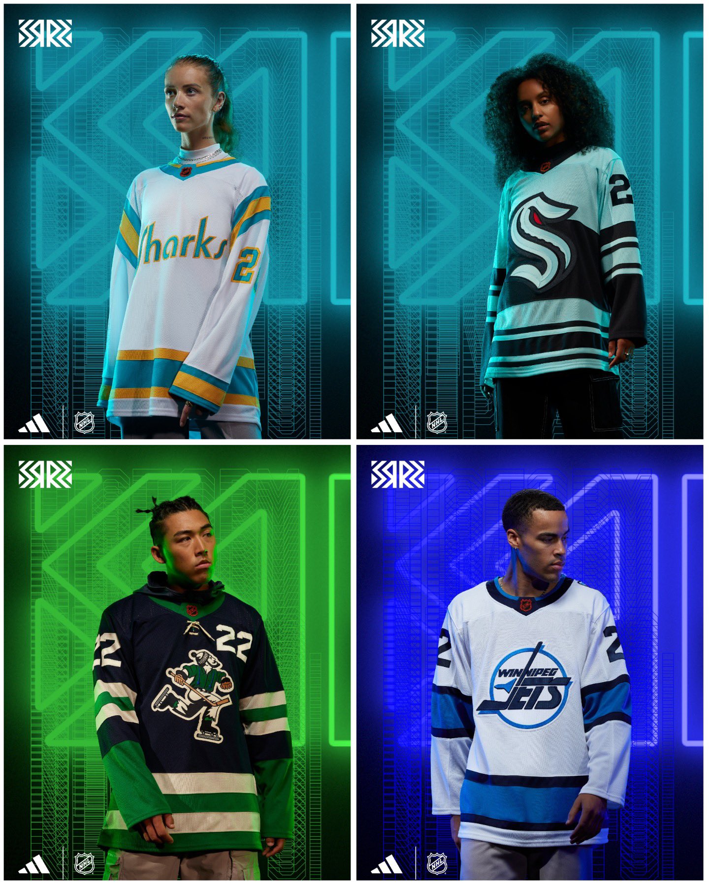
San Jose Sharks
JZ: “Big fan. Like the color scheme.” A
GB: “I like it.” A
MT: “I believe they’re going to go with teal pants.” B+
Seattle Kraken
GB: “Gotta love a throwback retro of a team that’s been in the league for one season. It’s ugly.” F
JZ: “I think they did the best they could.” B
Don't like ads?
MT: “They can’t do anything retro, so they just kind of tweaked what they got. I think it looks fine.” B
Winnipeg Jets
JZ: “I wish they would have just brought back the white jerseys from the Tkachuk/Selanne era.” B+
GB: “I love the logo, but the jersey, eh, it doesn’t pop.” D+
MT: “It makes me shrug.” ¯_(ツ)_/¯
Vancouver Canucks
JZ: “These are freaking awesome. They knocked it out of the park.” A+
GB: “The colors are great. I love the old logo. If I was a Canucks fan, I’d totally buy this.” A+
Don't like ads?
MT: “Their AHL team has the same setup. It takes a little bit away, for me.” B-
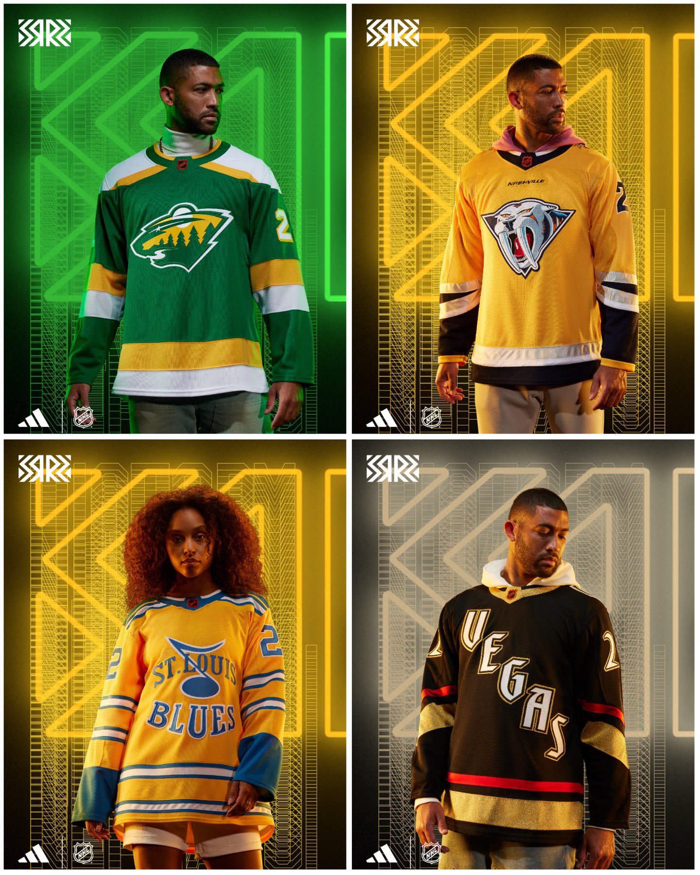
Minnesota Wild
JZ: “This is basically the North Stars jersey with the Wild logo. Looks awesome.” A
GB: “The North Stars still exist! They play in Dallas! Get over it!” F
MT: “I have it half eaten five dollar footlong. It just reminds me of Subway.”
Nashville Predators
JZ: “Let it go with the mustard yellow. No one cares. I dislike it…I hate it…I want less of it. This jersey sucks.” Fart –
GB: “Everything about the Predators is garbage.” F
Don't like ads?
MT: “You’re embracing the mustard cat.” F
Vegas Golden Knights
GB: “I’m gonna surprise the shit out of you guys. I gave it an A. The font is from the Excalibur hotel, and the letters are from the Stardust Hotel.” A
JZ: “They look sweet.” B+
MT: “Greg’s history lesson made it a B+ from a B.” B+
St. Louis Blues
JZ: “I loathe these. These look like the thing you buy at Kohl’s on the discount rack. I hate it.” D-
GB: “I don’t hate it. It’s creative. It’s different. It’s a cool lookin’ logo.” B
Don't like ads?
MT: “I gave it a D.” D
There you have it. All 32 Reverse Retro jerseys are graded and rated. Let us know what you think in the comments or on our Twitter account.
Get Chicago's Best Sports Content In Your Inbox!Become a smarter Chicago sports fan with the latest game recaps, analysis and exclusive content from CHGO’s writers and podcasters!
Just drop your email below!
Comments
Share your thoughts
Join the conversation
The Comment section is only for diehard members
Scroll to next article
Don't like ads?
Don't like ads?
